Pearl Grey
Visual identity for a bubble tea brand

Overview
I lived in London for ten years and saw many bubble tea brands on the high streets. The product intrigued me but the branding put me off. Much of it came across as fun but artificial.
Bubble tea would appeal to me more if the branding exuded a sense of heritage, calm sophistication, and focued on the craft of the product.
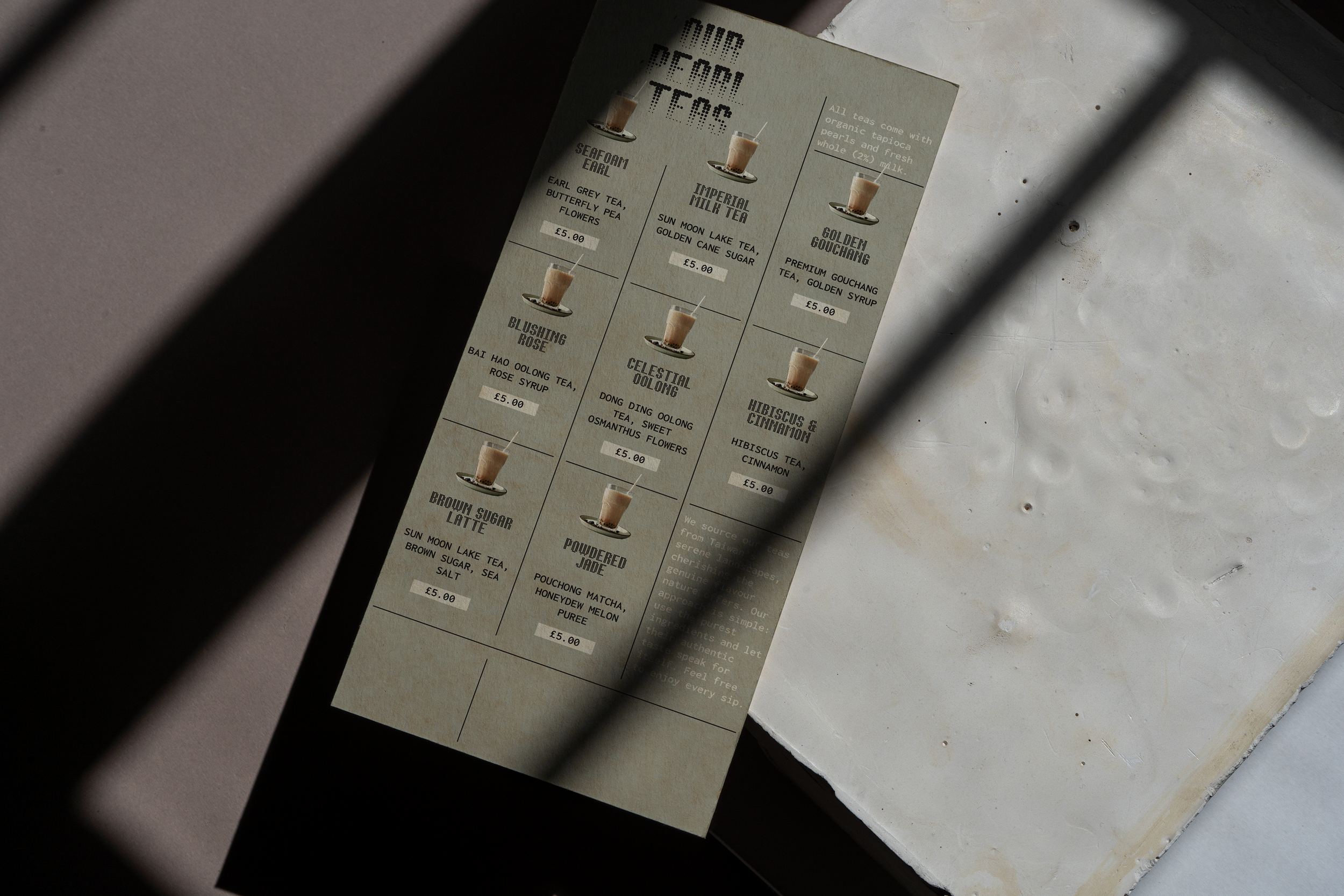
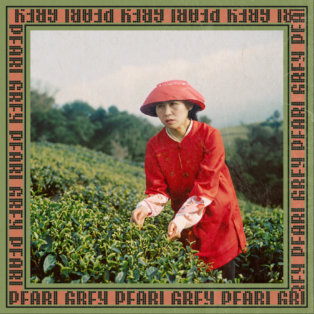
This is my take on a visual identity that is natural, refined, and distinctive. The primary visual motif is patterent typography and photography treatment that alludes to the tapioca pearls. The identity also features analogue design details and a muted colour palette to create a tactile and handcrafted feel.

A handful of the many (many) images that inspired me along the way. Swipe through for a more detailed look at each one.

Being half Finnish, I have many items from fashion and homeware brand Marimekko; including a few cups with this Räsymatto pattern designed by Maija Louekari. The original pattern is inspired by allotment gardening but I thought something similar could work in the context of bubble tea to represent the tapioca pearls.

The organic and irregular nature of the Räsymatto pattern is fun but perhaps difficult to implement consistently in the application. That's why I was drawn to the more structured and systematic work of Jurriaan Schrofer, a Dutch graphic designer and typographer known for his experimental type and layouts. I looked at many of his dot patterned designs.

I came across the Bertin typeface designed by Roman Seban at type foundry 205tf. It’s inspired by Schrofer as well as French cartographer Jacques Bertin. The modular typeface has two families, Bertin Dot and Bertin Square, of which the first became the primary font for Pearl Grey.

The decorative pattern strips of this Vis & Veg cookbook published by Snor stuck in my mind.

I researched some contemporary Taiwanese graphic designers to get some sense of what design conventions I could apply to this project. A few things stood out: vertical layouts, the overlapping of type and imagery, and stamped elements. Pictured: book cover design by Wang Zhi-Hong.

I liked this image showcasing the Rajola typeface by error.error.studio. I could picture the Bertin typeface being combined with Taiwanese teaware to create an interesting contrast between flat and 3D elements.
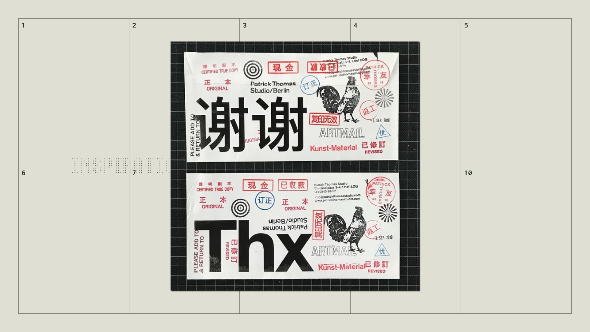
An example of printed type and stamps. This is from designer Patrick Thomas.

Paper textures felt important to create that tactile feel.

Muted colours from Studio Beautiful Problems.

Kapihan was one of my local coffee shops when I lived in Battersea, London. Their packaging had a strong sense of place. Brand identity designed by Jo Malinis.
Logo
TBC

Typography
TBC


Colour palette
TBC


Photography
TBC


Packaging
TBC