
Ivie (Powered by Holland & Barrett)
Visual identity, Packaging design, Artworking, Web design, Illustration, Iconography
Bringing a 'Pentaward Bronze' winning brand concept to life for the British multi-national health food retailer

Bringing the brand to life across the web, app, packaging, and in-store marketing
Holland & Barrett is a British multi-national chain of health food stores. In 2023, they launched Ivie, a health test brand providing accessible ways to track one's health metrics. The pilot product was a range of at-home finger-prick blood test kits.
London-based agencies Kuba & Friends and Derek&Eric created the award-winning brand concept and toolkit, which outlined the key components of the visual identity.
As Brand and Marketing Designer at Holland & Barrett, I:
- worked with copywriters to develop tone of voice guidelines
- artworked the packaging
- designed the launch website
- designed illustrations, iconography, and branded photo assets for the website and app
- designed printed marketing collateral
An eye-catching departure from healthcare design conventions
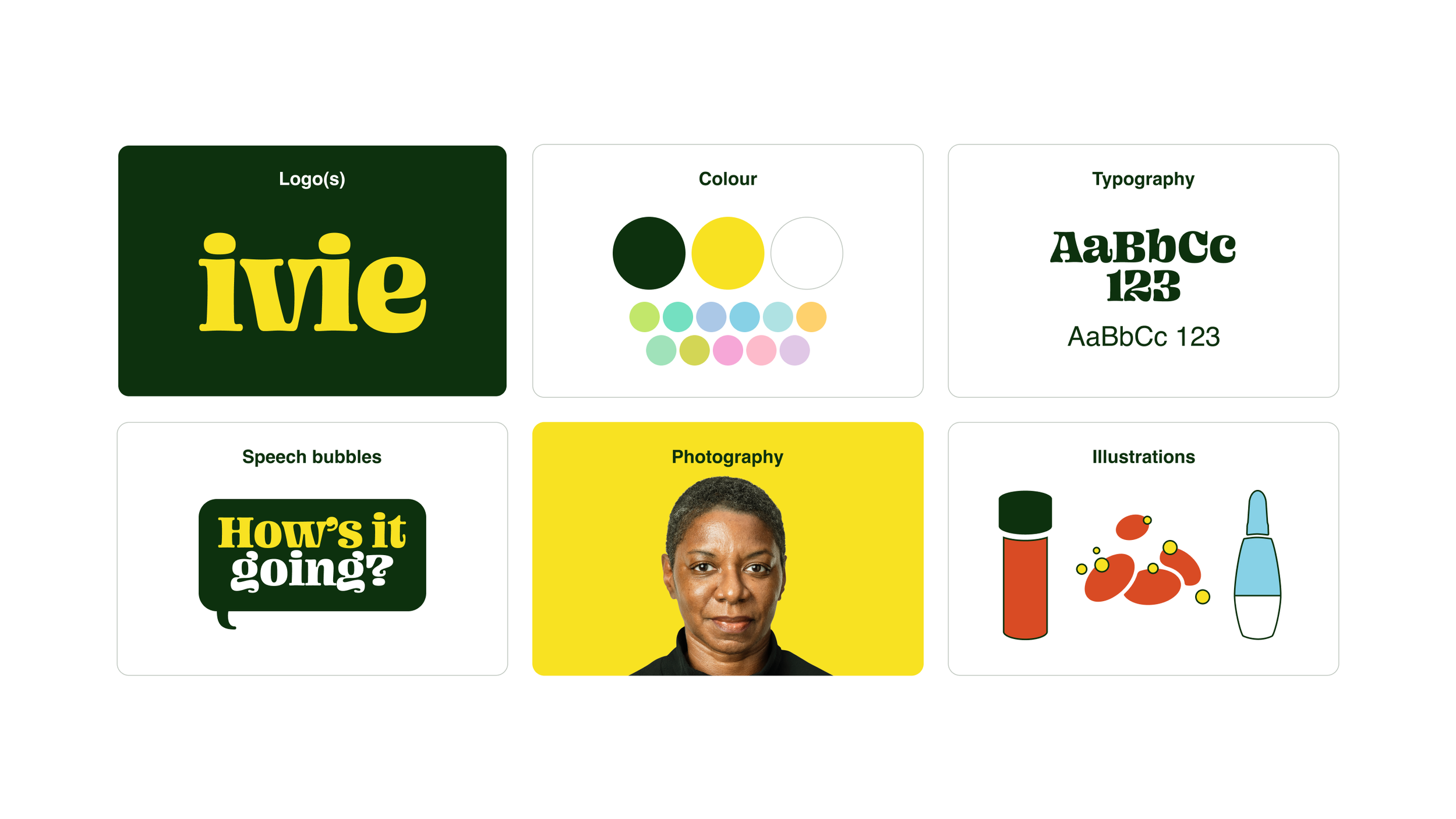
As a brand character, ‘Ivie’ is like your cool health conscious cousin. She empowers wellness in you by being positive, motivating, and understanding—but not coddling. And her wisdom comes with heaps of character. Ivie's visual identity brings these traits to life.
Key to the identity is Ivie’s conversational personality. We visualised this with the speech bubble device and our characterful primary typeface—Ohno Blazeface (designed by James Edmondson at Ohno Type Co). Helvetica serves as a conservative secondary typeface for when we need to communicate clinical credibility.
Dark green and bright yellow are an intentional departure from clinical conventions. The palette pairs well with that of Holland & Barrett, maintaining a visual link to the parent brand.
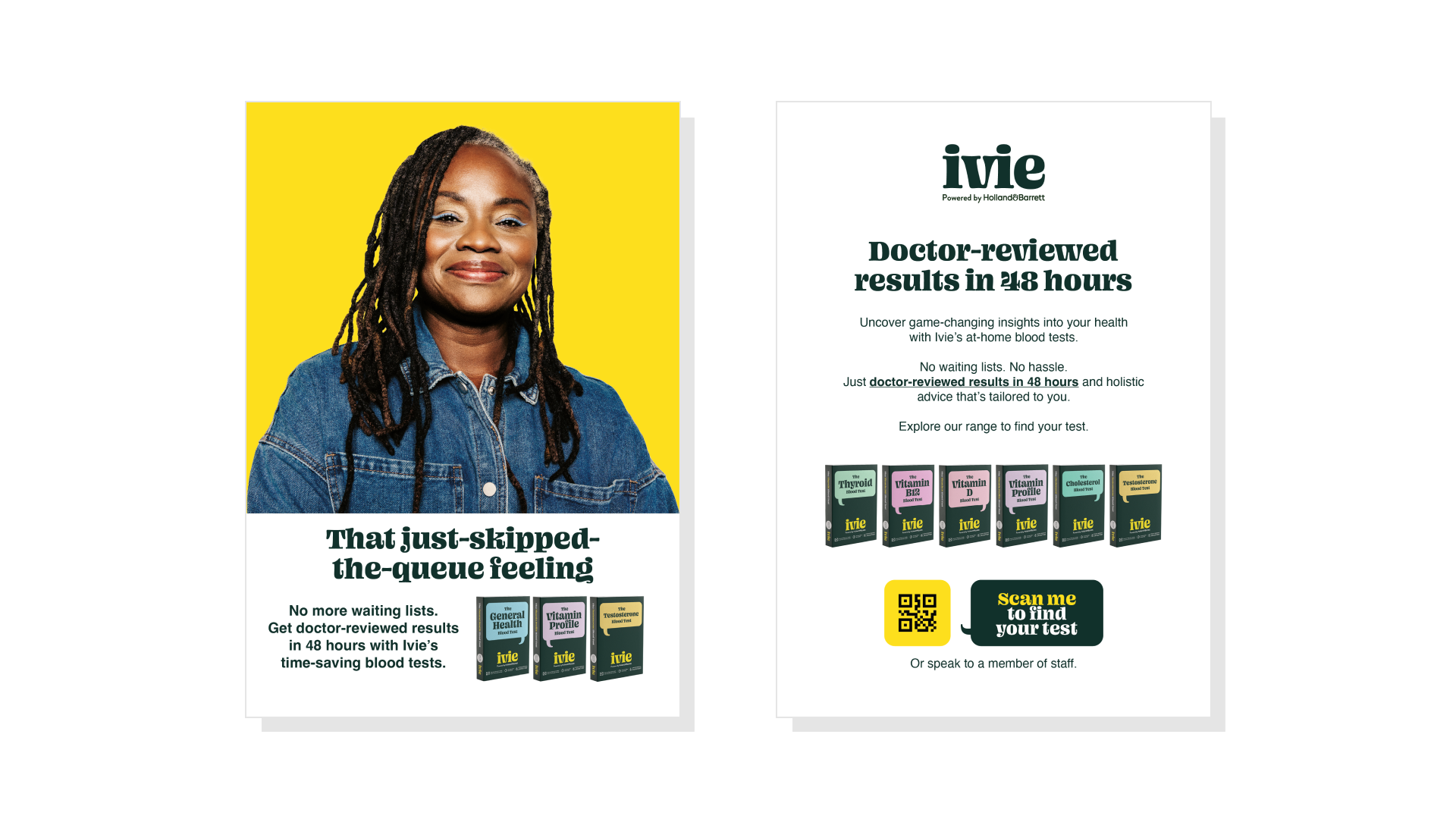
The photography represents real people, not airbrushed models. The target audience is regular health conscious people looking for ways to feel better.
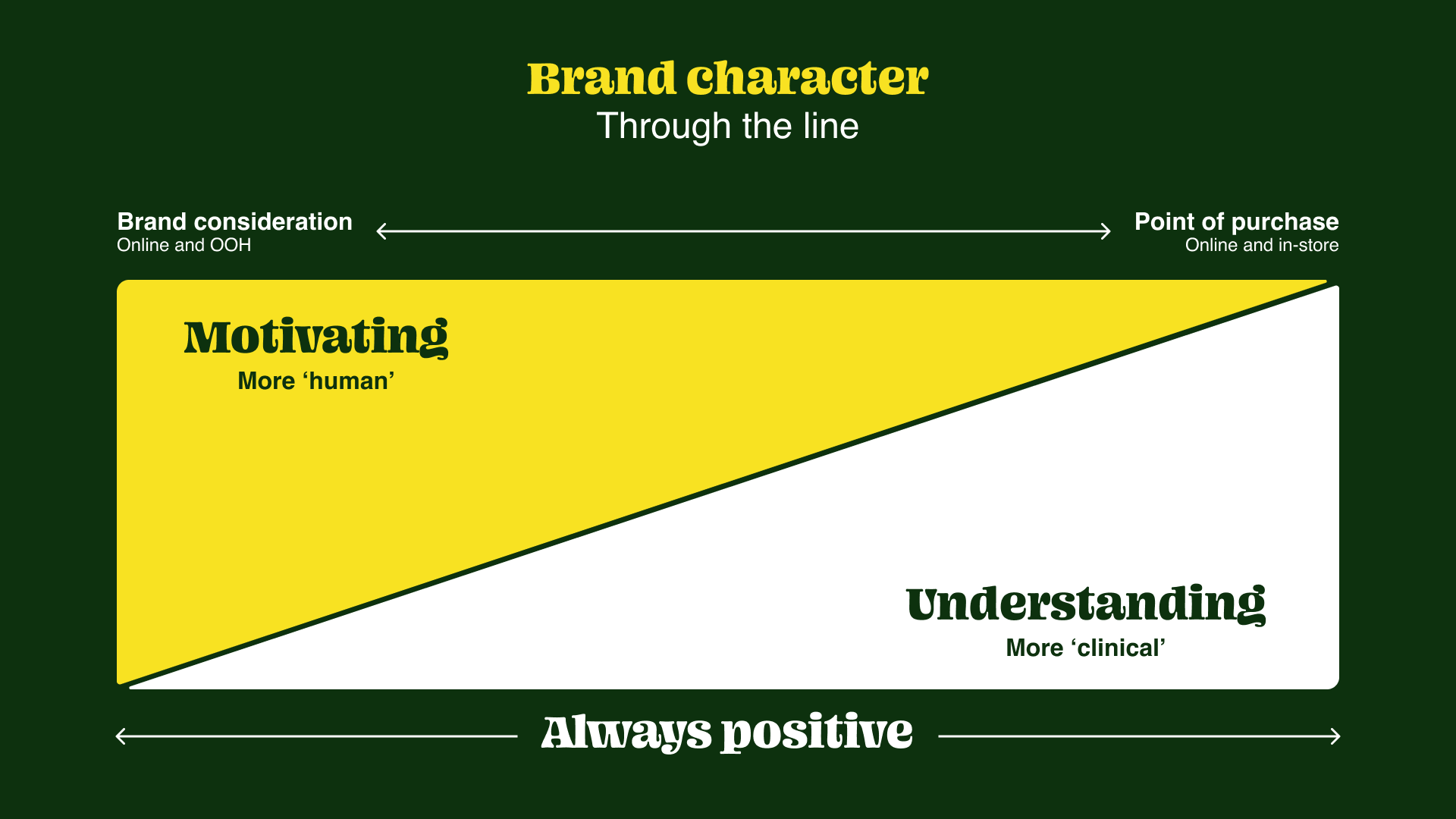
How one dials a brand's personality traits up and down depending on the context is an important consideration. This slide in the visual identity and tone of voice guidelines serves as a reminder of the necessary balancing act between character and clinical credibility.
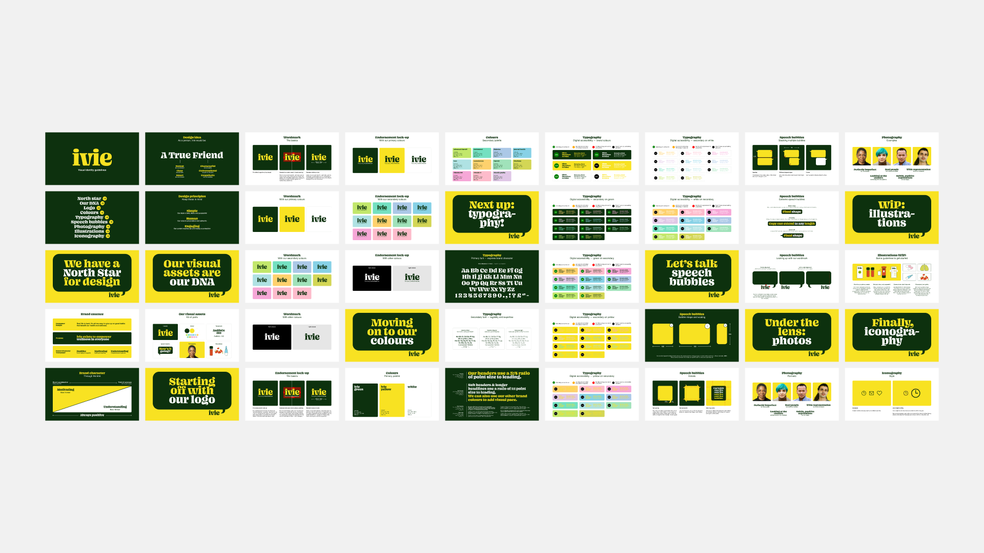
Visual identity guidelines
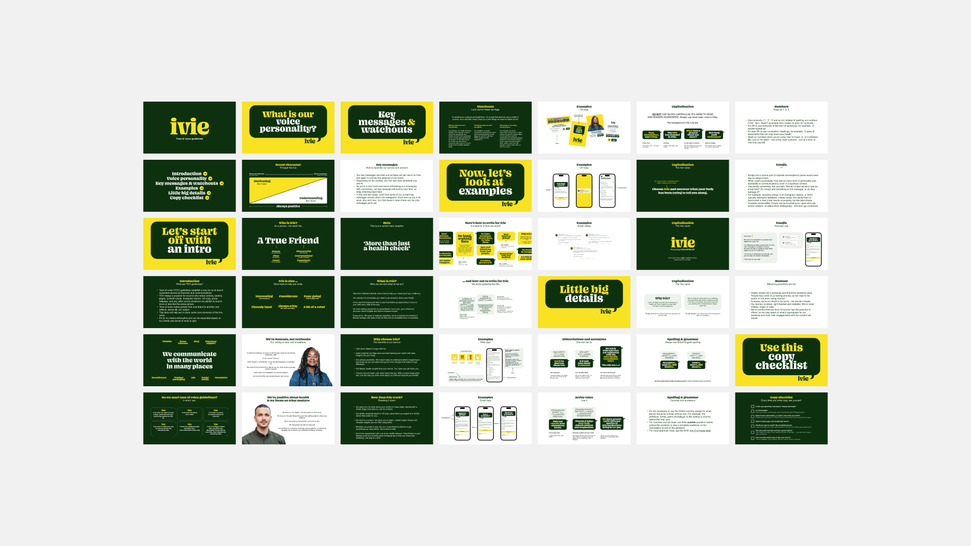
Tone of voice guidelines
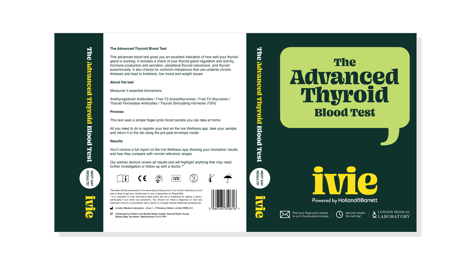
Stand-out packaging that celebrates the positivity of health and wellness with colour
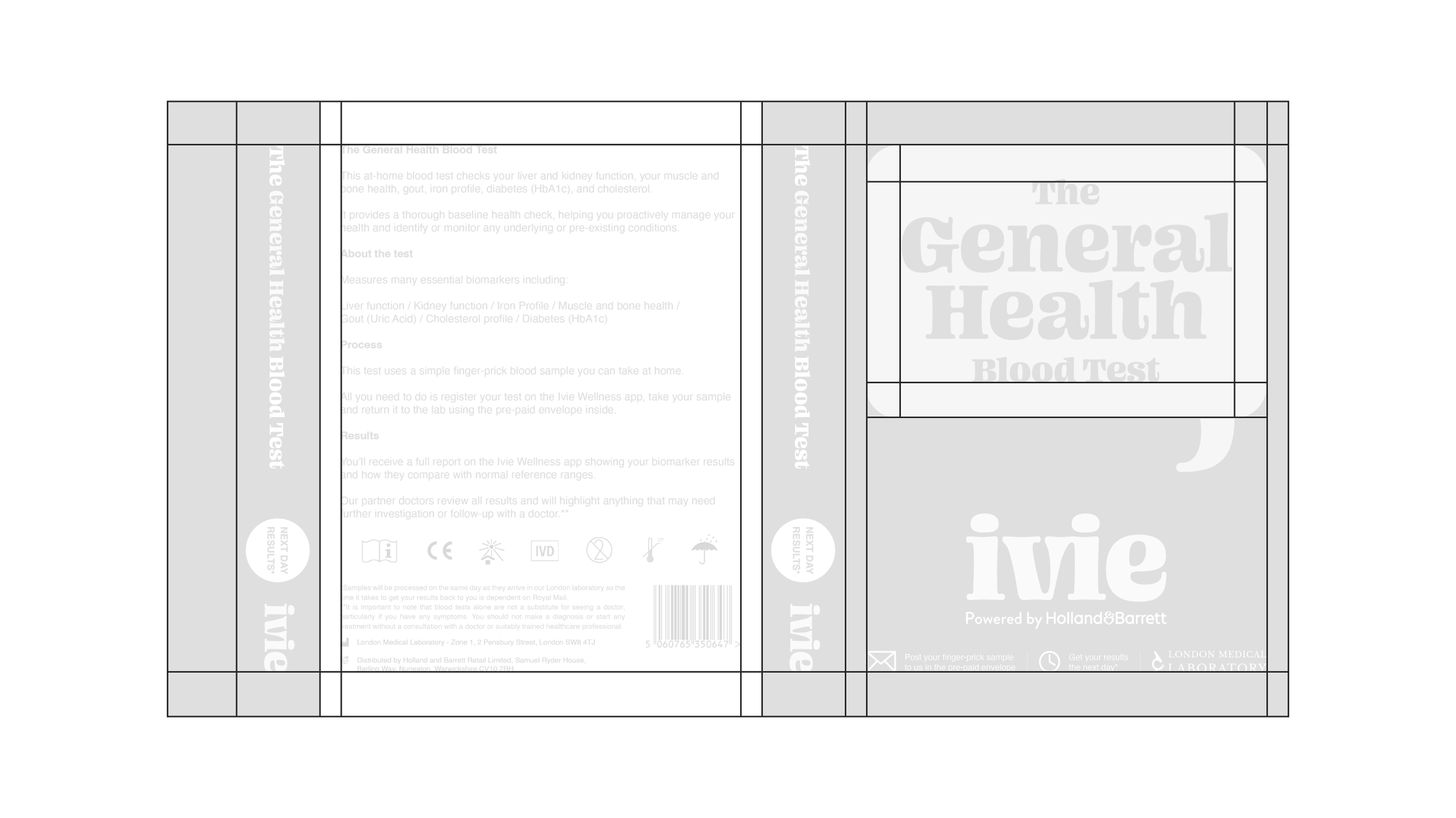
The packaging is a thick paper stock folded into a sleeve that slides over the box containing the sample collection equipment.
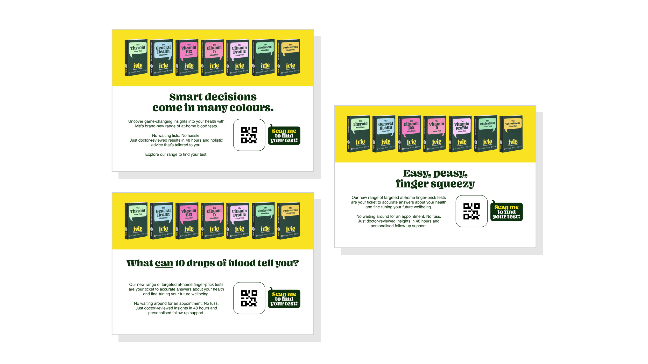
All 11 tests in the range follow the same layout. The differentiating factors are, of course, the title as well as the colour of the speech bubble.
We featured the speech bubble on the cover because it's a key visual motif. The proportions follow the rules defined in the guidelines: the radius of the corners is always 8% of the speech bubble's longest side. This also determines the margins for the text inside the bubble. The height of the tail should be somewhere between 0.5x and 2x the margin/corner radius. One can position the tail on the left or right. It's always aligned with the margin.
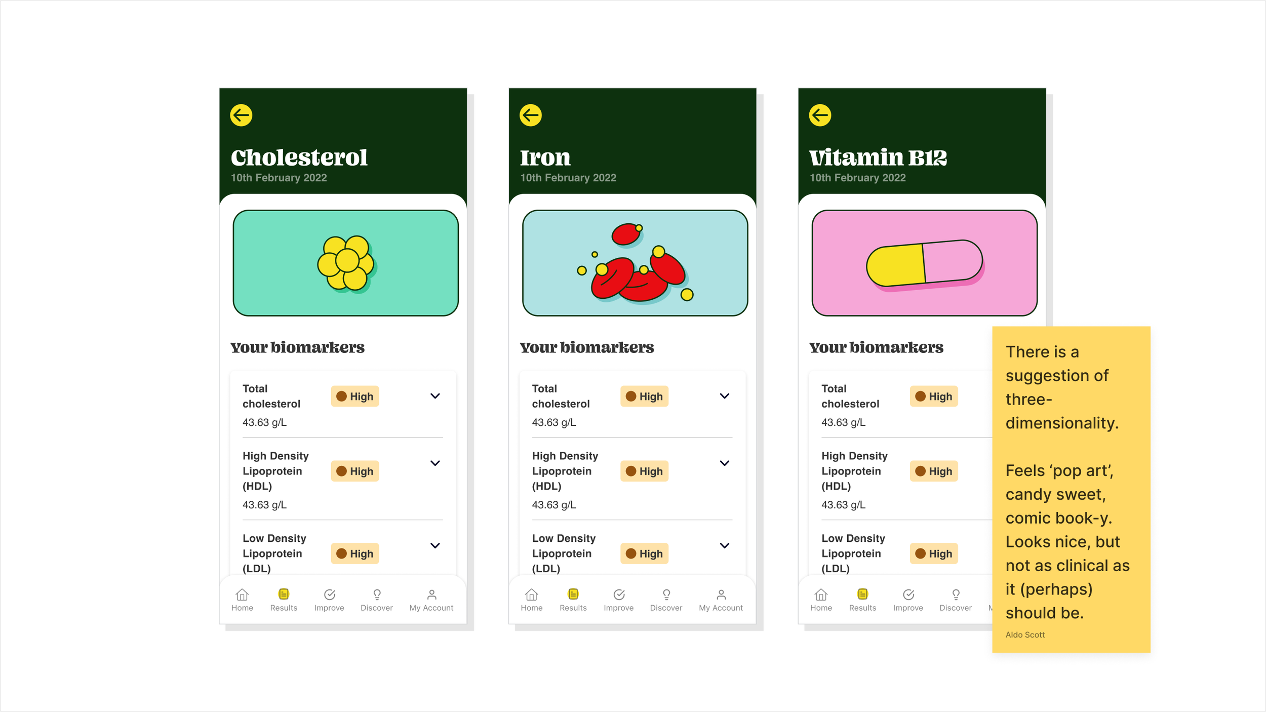
Developing a style of illustration
One identity element not provided by the agency was illustrations. We needed a way to visualise communications without needing to rely on photography.
I aimed to develop a simple style that felt consistent with our identity. Looking at our wordmark and speech bubbles, the illustrations should consist of bold shapes, minimal details, and rounded corners.
The exploration was a push-and-pull process of finding the right balance between expressiveness and clinical credibility in terms of style and use of colour.
See some examples of live illustrations and unused explorations.
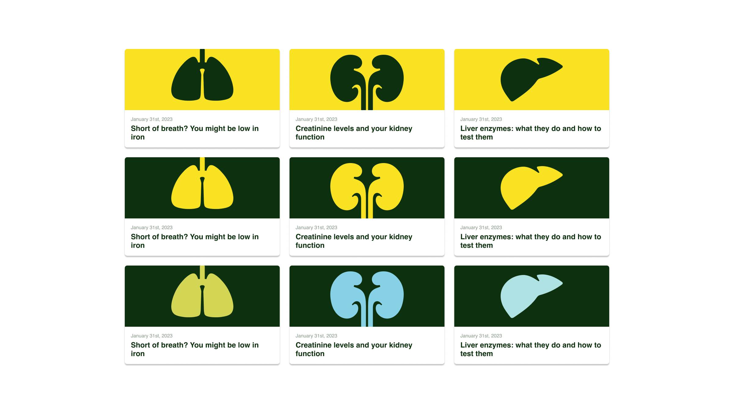
Illustrations and iconography for the Ivie Wellness app.
Exploration.
Exploration.
Exploration.
From Figma to Shopify: Designing the e-commerce site
The website was a collaborative project between the copywriters, product designers, developers, and myself.
The site is based on a Shopify template which we customised to suit our needs. I started the process by combing through the template and writing dev tickets specifying the changes I would need to make it work for us.
With user insights from product designers and UX researchers as a guide, I worked with copywriters to design the layout and content in Figma.

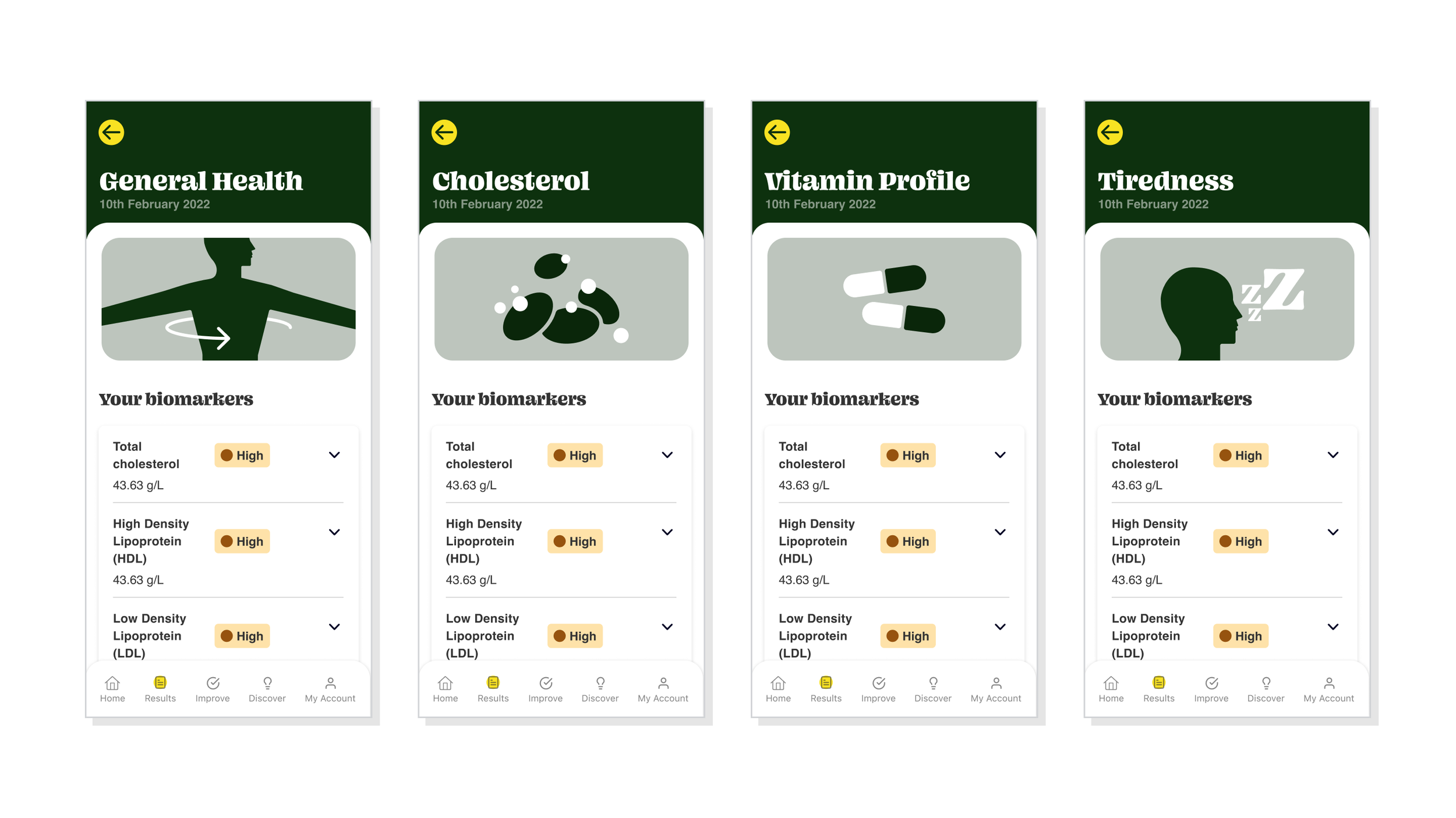
Launch website homepage hero section. The idea was to articulate the benefit of the service in simple language. The image shows what you get: a list of your biomarkers and labels indicating which ones are out of range.
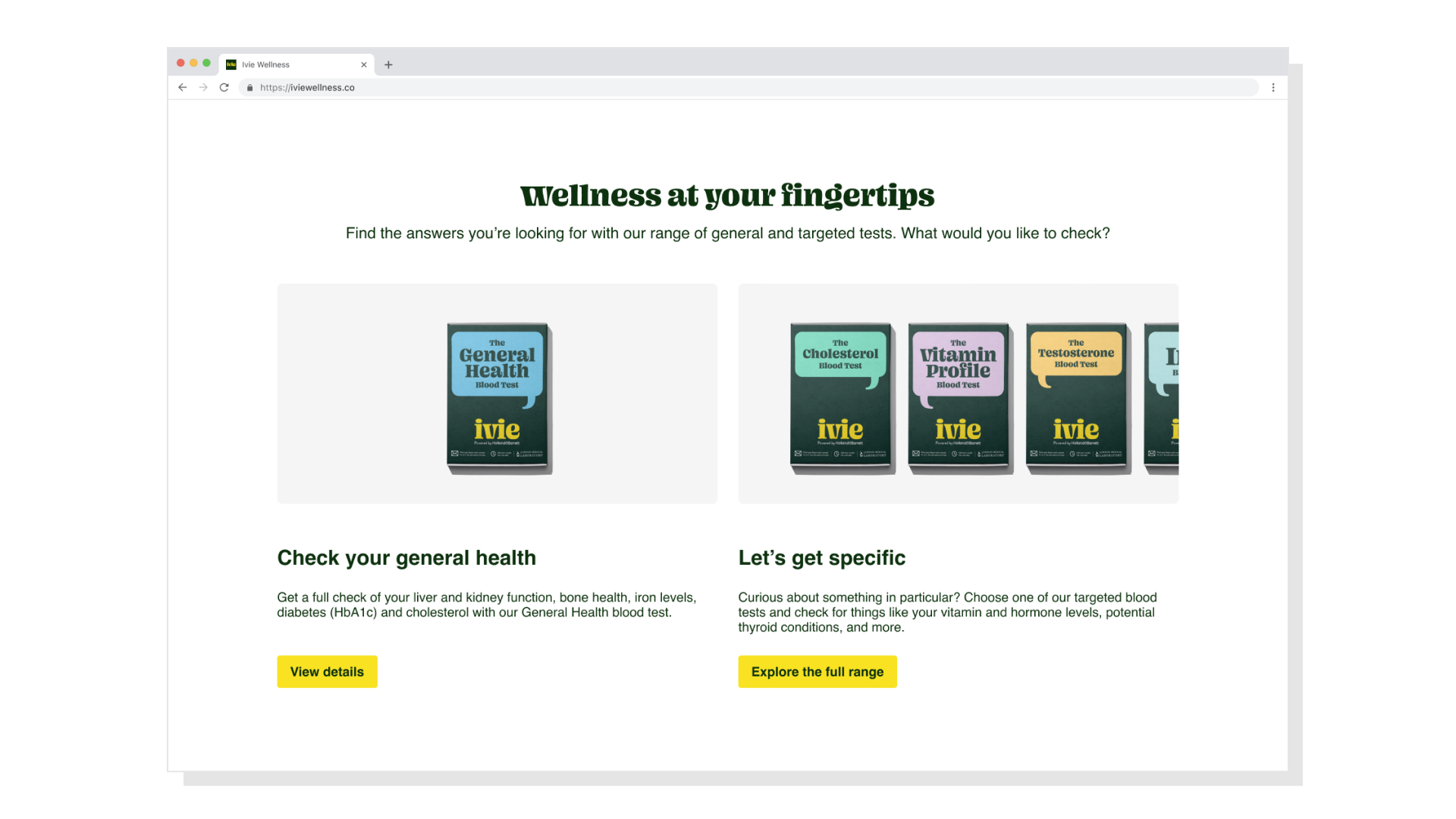
Many users wouldn't know what to test. And we didn't want to cause analysis paralysis by presenting all 11 options in an unfiltered way. So we broke the range down into two simple choices as a starting point.

Video call mock-up. Of course, it's not a literal representation of the user interface but it conveys the essence of the feature: video calls with a friendly expert.

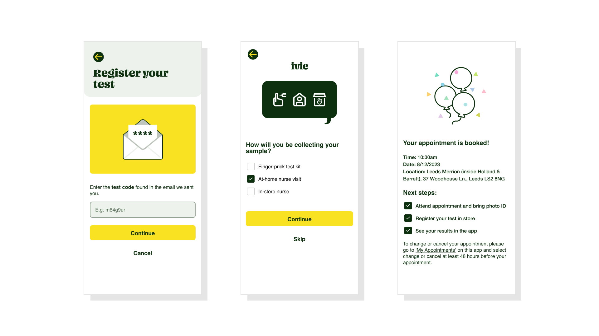
Illustrations visualising how the process works from kit registration to receiving results in the app.
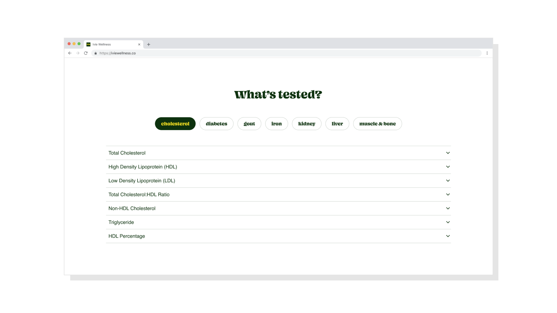
An FAQ accordion. We needed a tabbed system to group biomarkers into a space-efficient content block. One of the features not originally available in the Shopify template.
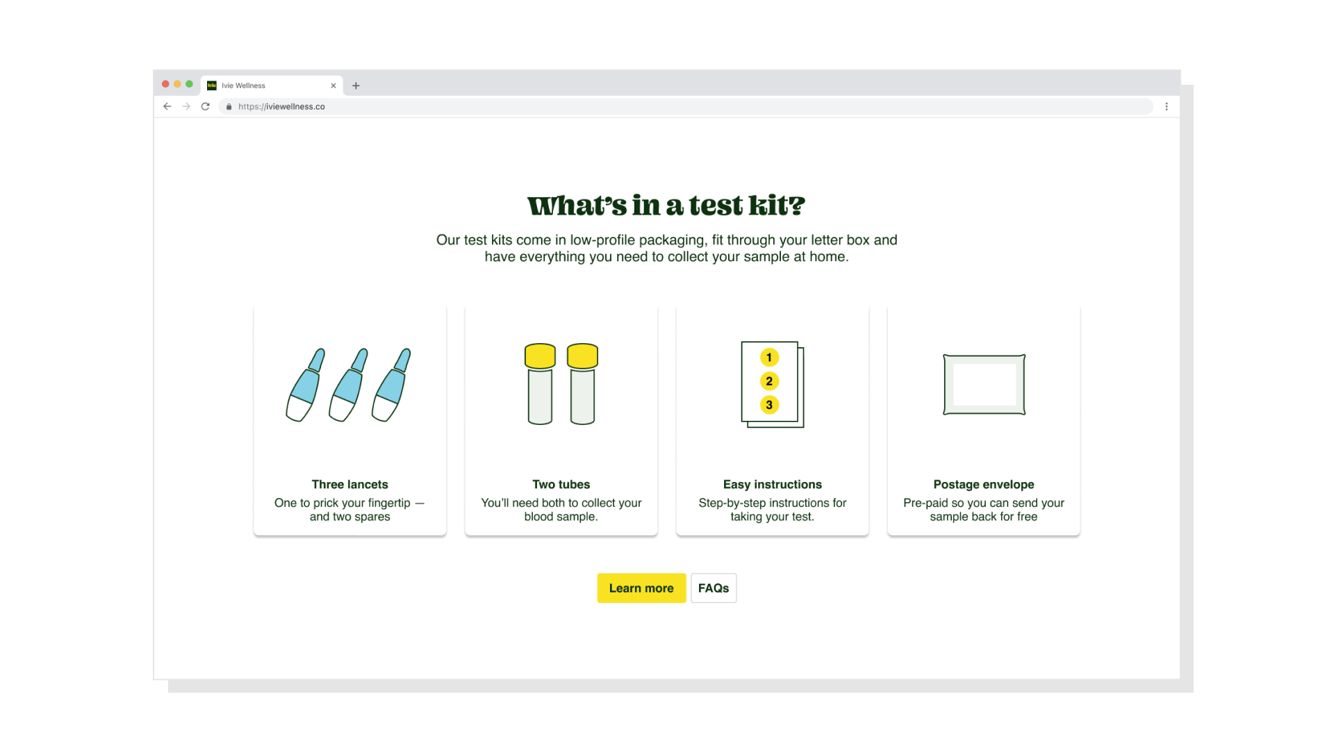
Kit content illustrations.

Product detail page.
Printed marketing collateral for stores and events
In-store (i.e. Holland & Barrett) flyers aimed at boosting awareness of the Ivie tests.
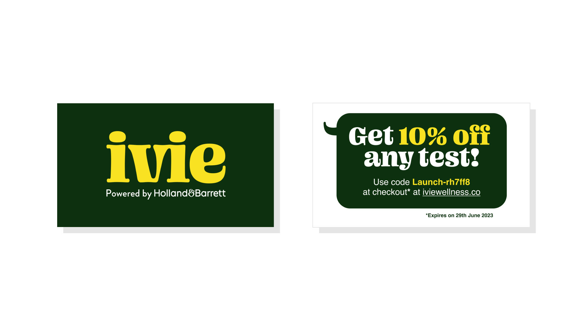
Discount code printed on business cards which we distributed at an event.
Creative credits
- Creative Agency
- Kuba & Friends
Derek&Eric
- Content Writers
- Emily Kemp
Augusta Grey
Cecilia Dominici
- Product Designers
- Charis Kapodistria
Natasha Hine