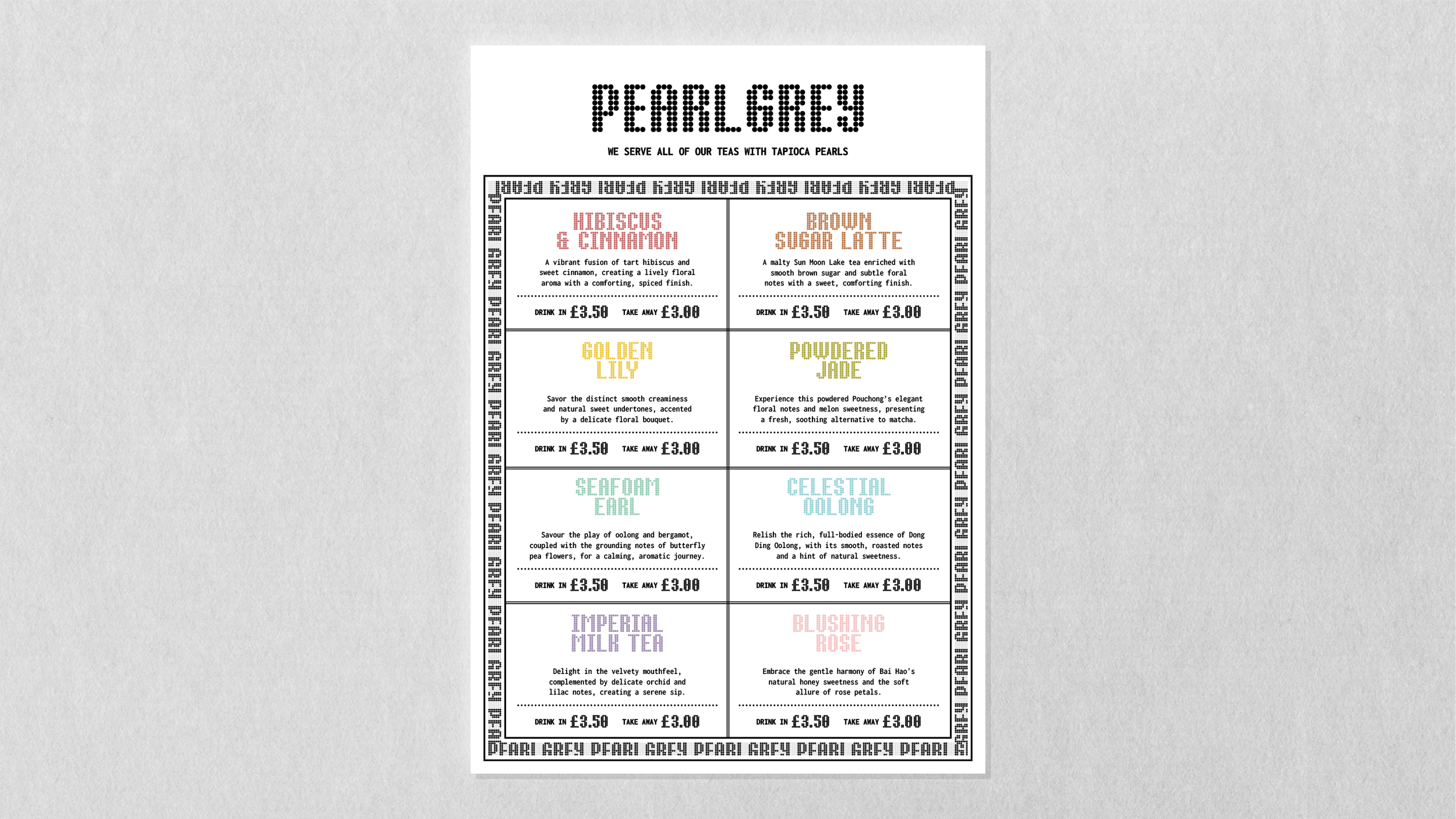
Pearl Grey
Visual identity, Packaging design
Visual identity and packaging design exploration for a fictional bubble tea brand.

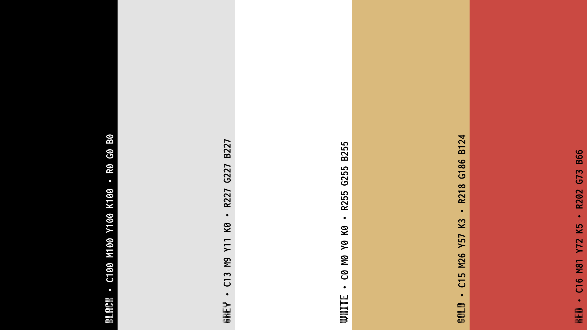

Typography — Bertin and Inconsolata
The primary typeface for the identity is Bertin, designed by Roman Seban at type foundry 205TF. It's a modular typeface inspired by the work of French cartographer Jacques Bertin and Dutch graphic designer Jurriaan Schrofer.
I'm using the Bertin Dot family, which uses circular modules which tie in nicely with the tapioca pearls.


Inconsolata, designed by Ralph Levien, serves as a supporting monospaced typeface. It helps to create the impression of hand-pressed lettering one might find on shipping boxes and labels.
Like in Bertin, the letterforms are narrow and the details, such as the bars on the capital 'i', are a good match.
Were this a commercial project with some budget behind it, I might consider something like GT Pressura for an even better fit.


Photography — Generative AI with Adobe Firefly
I used Adobe Firefly to generate images of Taiwanese tea farmers amongs the rows of Camellia Sinensis. I won't claim the imagery is authentic, and the details aren't perfect when it comes to the physical features of the people or the clothing.
But the intention was to obscure the details anyway by creating a mosaic effect in Photoshop and imparting just the impression. The colour of the farmer's outfit serves as a product differentiator.