
Vacation Villas Property Management
Logo design, Stationery design
Logo design and printed marketing collateral for a family-owned holiday rental company in Kissimmee, Florida

Typography
The central design element is the block lettering. It serves as a holding shape for Florida-themed photography.
I chose Antique Olive as the primary typeface. It has a thick stroke width that allows the imagery to come through. Quirky shapes (e.g. C, O, and S) add character.
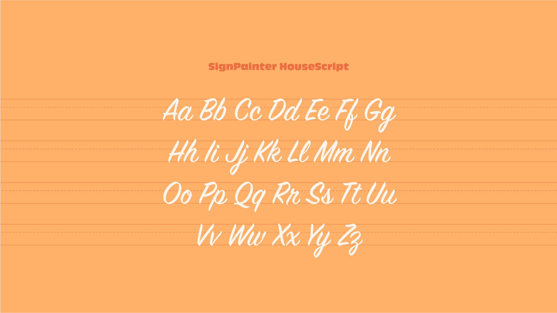
To complement, I chose a script font to emulate a handwritten look.

Logo design
With the typefaces chosen, I designed the logo in Illustrator.
In the 3D lettering, the inner white border provides a frame for the images. The pink and black bevels separate the lettering from the background and add some weight.
The selection of imagery was a collaboration between the client and myself. They wanted to capture the Florida experience in terms of sights, experiences, food, and drink. To create a harmonious look, we selected images with clear focal points and a colour palette featuring blues, pinks, greens, and oranges.


Logo application
The logo is mainly for business cards and promotional postcards. To complement these materials, I made a basic sunset illustration that brings everything together and reminds of old travel posters and postcards from the mid-century era.

