
Europe Magazine
Logo design
Logo design for an online publication visualising European social issues through data.

Developing an existing icon into a wordmark
Europe Magazine is an Instagram account that “[visualises] Europe’s complex social issues through maps, infographics and statistics.”
They want to expand beyond the social media platform. I offered graphic design help as a volunteer.
I proposed developing a versatile wordmark for potential future applications. Europe Magazine’s existing icon was a modified version of the letter ‘E’ set in Futura Black. There was no wordmark as such; just the name of the publication set in Futura PT Condensed.

Europe Magazine's original icon was a modified version of the letter 'E' set in Futura Black.
The modification is the rounding of the stem.
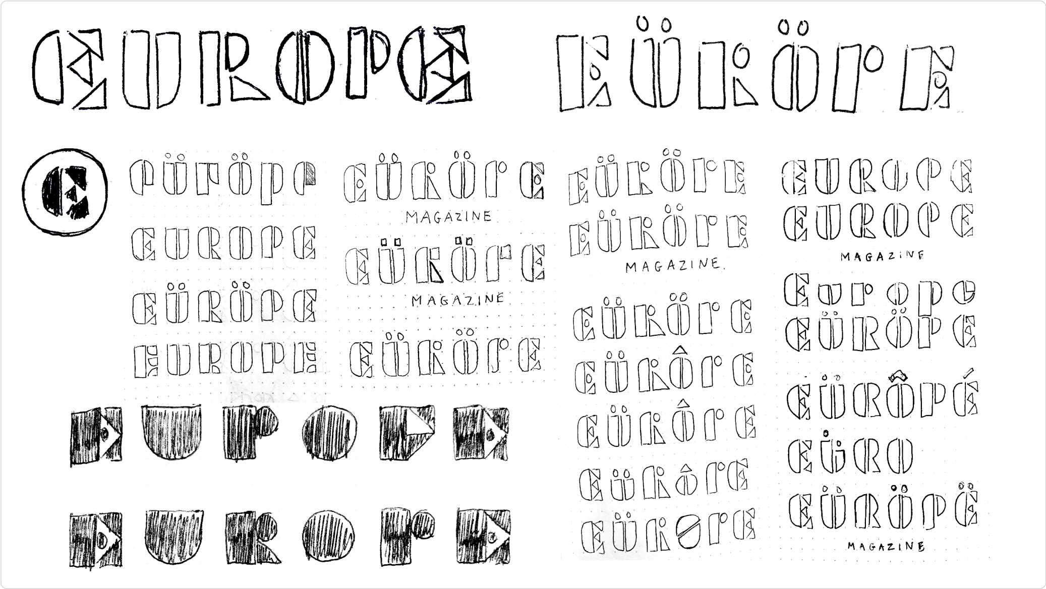
Taking cues from the original icon and Futura Black, I started sketching some ideas on paper.

I used the rounded stem as it was to design the rest of the lettering. But the generous rounding produced issues.
I pushed the rounding of the stem outward, creating sharper corners.

I liked the sturdier, more rectangular look of the lettering with the modified stems.

I thought the 'O' needed a counter to further differentiate it from the 'U'. Especially at smaller sizes.

I added overshoot to the 'U', 'R', 'O', and 'P' to compensate for the lack of straight edges at the top/bottom.
Sample applications
Coming soon.