
Brainlabs
Visual identity, Social media design, Editorial design, Editorial illustration, Presentation design, Web design
Brand and marketing design for a data-driven and process-oriented performance marketing agency

Designing according to F.A.S.T. principles: Formalise, Automate, Share, Test
When I joined Brainlabs, I spent eight months as a Creative Specialist in the Programmatic team supporting account managers and their clients with creative recommendations for their display advertising campaigns.
Then, I moved to the in-house marketing team where my focus shifted toward brand and marketing design. The work samples below are from this role.
Brainlabs embraced a data-driven approach to marketing to the extent that most employees had degrees in subjects like mathematics, physics, and computer science.
Brainlabbers worked according to the company's F.A.S.T. principles: Formalise, Automate, Share, and Test. Translation: where possible, create an automated process, share it with colleagues, and keep iterating on it. This applied to everything from generating campaign reports in Google Sheets to scheduling job candidate interviews.
Brainlabs balanced this cerebral nature with a loud self-confidence aimed at setting itself apart from competitors and being memorable.
Thumb-stopping creative helping to double our LinkedIn following from 4,000 to 8,000
The marketing team created content about our services and expertise in areas that don't make for interesting visuals: campaign management platforms, software tools, marketing automation tech, and the like.
Basically, a bunch of UI elements and strings of code. No one wants to look at that.
My role was to design bold and playful images to stand out on our LinkedIn feed. I used visual analogies to express what could often be dry and technical subjects. See examples below.

Featured image for a blog post explaining the integration between Search Ads 360 and Display & Video 360.

Featured image for an article analysing the Labour and Conservative parties' advertising spend on Facebook.

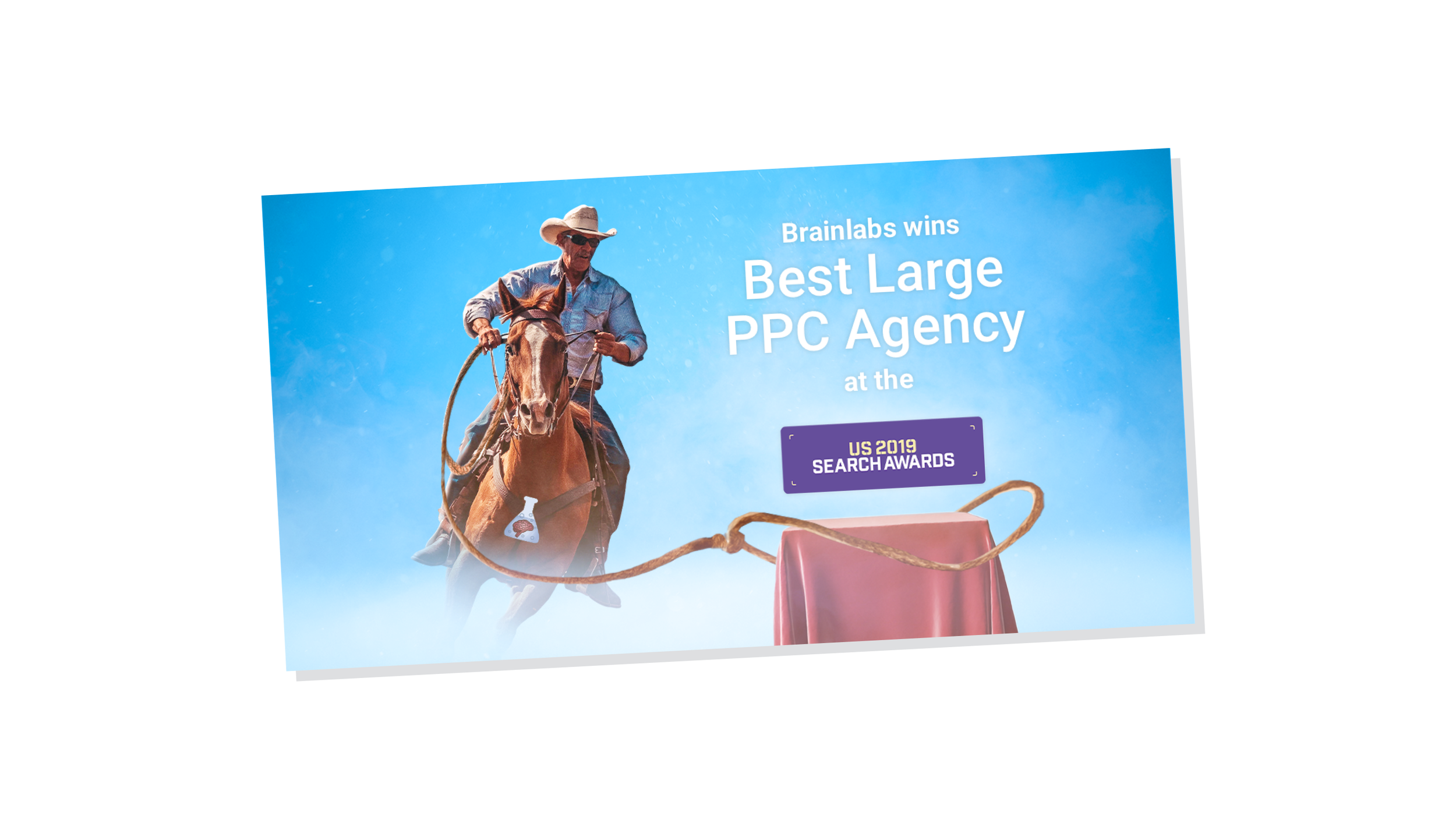
Award nominations (and wins) came in thick and fast. Of course, we shouted about each one with a new LinkedIn post.

I created the paper animation in Google Web Designer. The stamping hand and confetti added by video editor Dave Isoa.

Featured image for a blog post about the most valuable features in Search Ads 360.

Promotional image for one of our PPC Chat Live events.
Speeding up the production of our industry white papers
As part of our inbound marketing strategy, we produced a series of white papers examining the top performers in paid media. Freelance designer Delia Sveglia designed the first editions using InDesign.
As we ramped up production, it became clear that we needed to make the process more efficient. Each white paper contained 20-odd tables that required manual updating. And InDesign can be clunky for data visualisation.
Because I was the only designer working across many teams, I needed to free up time wherever possible. So I adapted the existing template into Google Slides. This allowed to update every table and chart with a click of a button from Google Sheets.
Content writers could now produce white papers from start to finish. Huzzah!
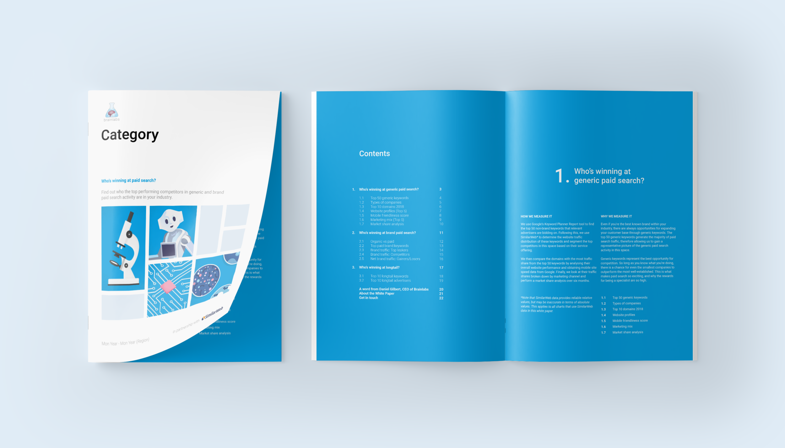
A mock-up of the front cover and contents spread.

Document layout grid.

Some of the many tables and charts that needed updating.

An overview of the entire white paper.
A versatile A5 booklet template for marketing and sales materials
We needed small printed booklet for many marketing and sales purposes. And the turnaround time was often a matter of two days. To speed up the production time, I designed a flexible A5 booklet template using InDesign.
The process started with some typographical decisions. The body copy would be 10pt. And the leading value would be 12pt. Larger classes of text would use multiples of these units.
Based on these units, I created a layout grid where each grid field is a perfect square. This made it quick and easy to scale images using common aspect ratios e.g. 1:1, 3:2, 4:3, etc.
Above and below the text field, there's enough space for the folio. The side margins are generous enough for the readers' thumbs to not obscure the content.


The cover of our press book, containing samples of our 'thought leadership' (i.e. articles published by industry press)

Simple single- and two-column structures.

Typographic hierarchy established with colour and scale. All text was sized according to the 12pt baseline grid i.e. leading values varied by 12pt increments.

Tidy columns of fully justified text with some word and letter spacing rules applied to minimise excessive gaps of uneven negative space.

I included my illustrations to bring an otherwise text heavy booklet to life.


Cover designs for booklets handed out at PPC Chat Live, one of our monthly events.


'Breaking' the grid by bleeding the illustration to the edges of the page.


3-column variation


A branded Google Slides template for busy account and sales teams
From a branding perspective, slide decks were among our most important touch points. They were what clients and prospects spent the most time looking at week after week.
Every account manager and sales person produced a new presentation every few days. And many of them were doing so without much design guidance. So I designed a new template with two goals in mind.
First, to provide a framework for aligning content on the slide using a layout grid. Much of the material in slide decks consistent of charts and tables. A grid would help with sizing and aligning them with consistency.
Second, to increase awareness of margins and spacing. The most common mistake with designing slides is packing them with too much content. The presentation becomes unfocused. Generous margins served as a visual nudge toward adopting a "one point per slide" approach.
With a more consistent layout from slide to slide, the deck would look tidier and more structured.
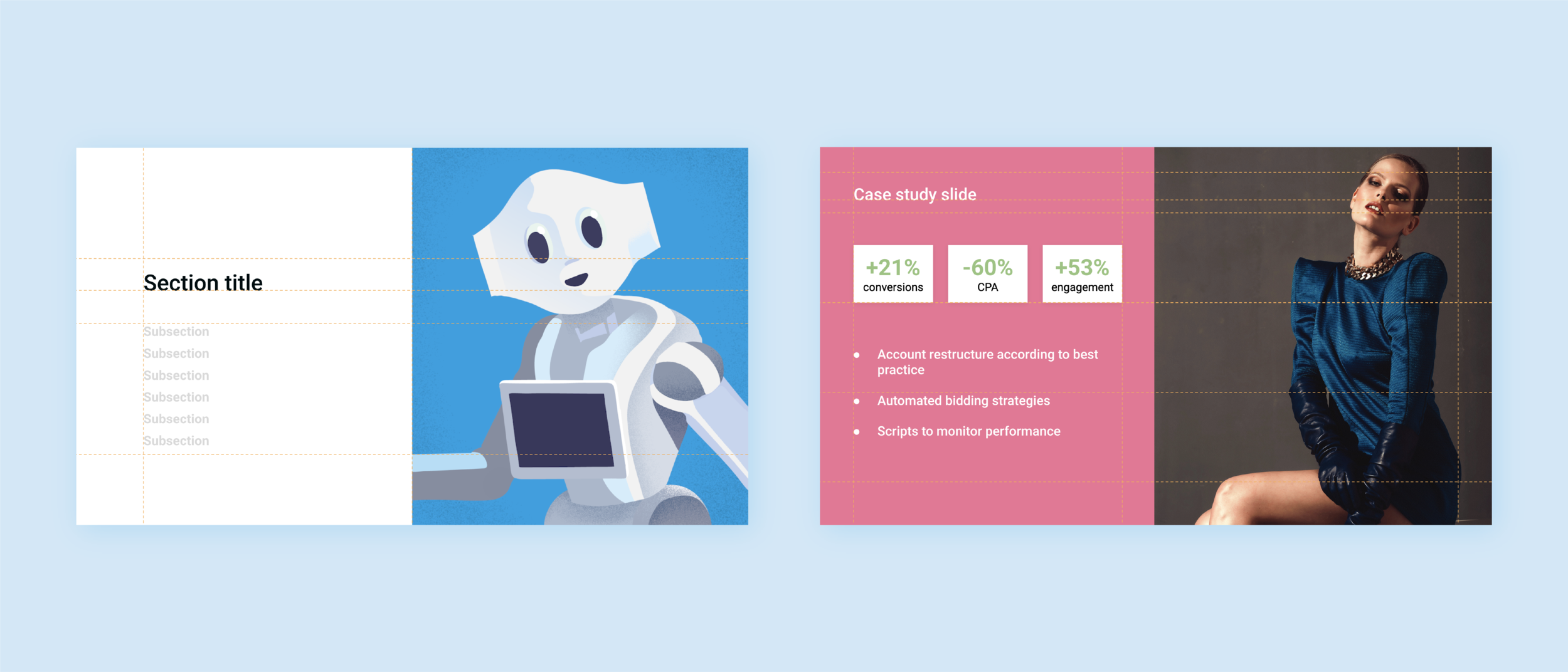
The illustrations on the section title slides served to:
- Communicate the scientific theme of the brand
- Reinforce brand colours
- Break up the otherwise geometric look of the rest of the template.

I shared a how-to "master deck" with all colleagues.

The layout grid could be toggled on/off when needed.

Sample layouts


Creative credits
- Content Writers
- John Lidiard
Nine van Strydonck
Meg Candler
Lucy Clifton
Caitlin Rozario
- Videographer
- Dave Isoa